Logo Refresh
Ten logo candidates for the Editorial Redesign aesthetic — spa calm, Vogue restraint, Italian craft. All are symbol-only marks in aged gold on warm ivory, drawn like something embossed on Italian stationery rather than floating in a cosmic gradient. The lockup row previews each beside a LUMENAL wordmark set in Italiana. As with Round 1, these are AI-generated concepts; the winner gets redrawn as clean vector art.
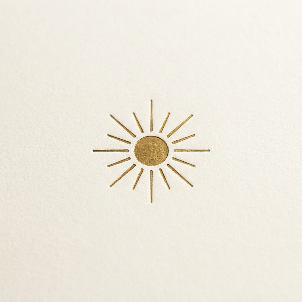
Sole Inciso
A gold-leaf sun with sixteen fine engraved rays — letterpress warmth, reads instantly as "light." The safest and most versatile of the ten.
LUMENALLockup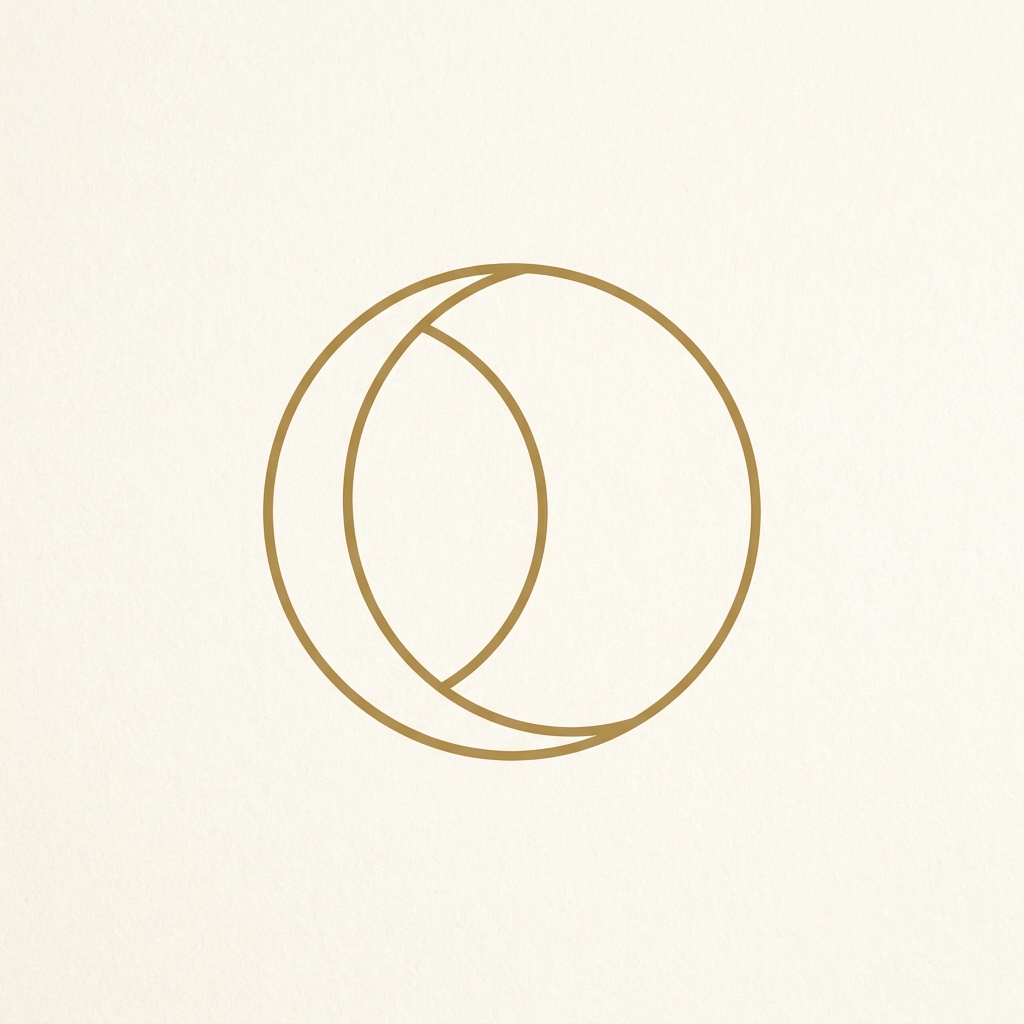
Mezzaluna
A slender crescent crossing a hairline circle — sun and moon in one quiet geometry. Elegant at any size; the most "jewelry" of the set.
LUMENALLockup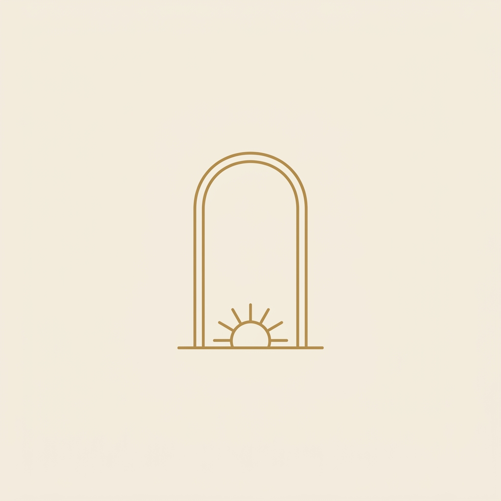
Il Portale
A Roman arch with a sun rising at its horizon — the spa-architecture signature drawn as a mark. Pairs perfectly with the Terme di Luce direction.
LUMENALLockup
La Stella
An eight-pointed compass star from an old celestial map — eight points for eight belief systems, with cartographic credibility. Vector trial →
LUMENALLockup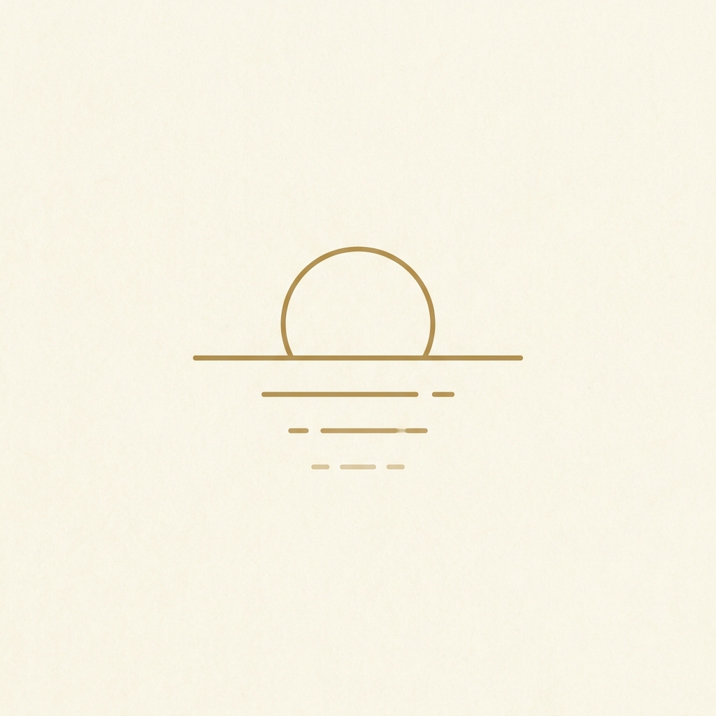
Riflesso
A sun over still water, its reflection fading in dashes — golden hour distilled to four strokes. The most Californian mark of the ten.
LUMENALLockup
Il Sigillo
A wax-seal emblem — a ring of fine rays around a sun-and-crescent pairing, like a grand-hotel crest. Made for packaging, reports and embossing.
LUMENALLockup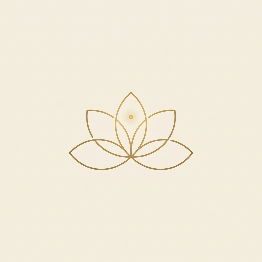
Fiore di Luce
Five unclosed hairline petals releasing a dot of light — botanical and precise, spa without being generic-wellness.
LUMENALLockup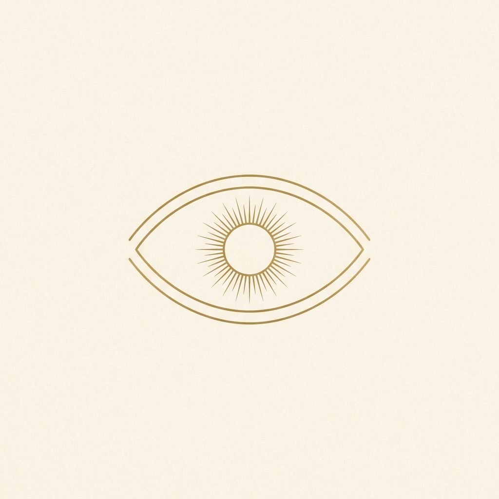
L'Occhio
A serene eye with a radiant sun for an iris — insight as the product, drawn with editorial restraint. Boldest brand claim; most fashion-forward.
LUMENALLockup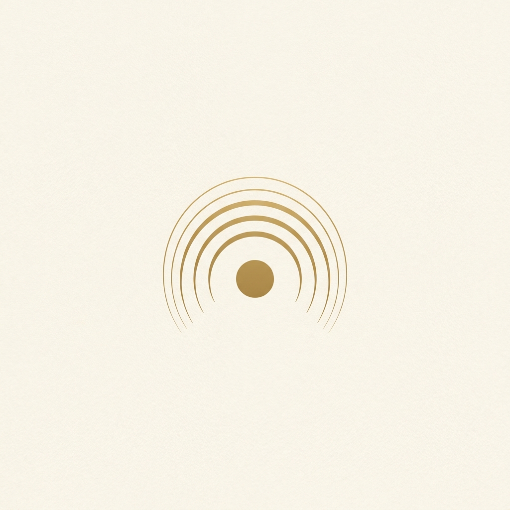
L'Aura
Three nested arches glowing over a gold disc — sunrise, aura and spa architecture in one gesture. Calmest mark of the set.
LUMENALLockup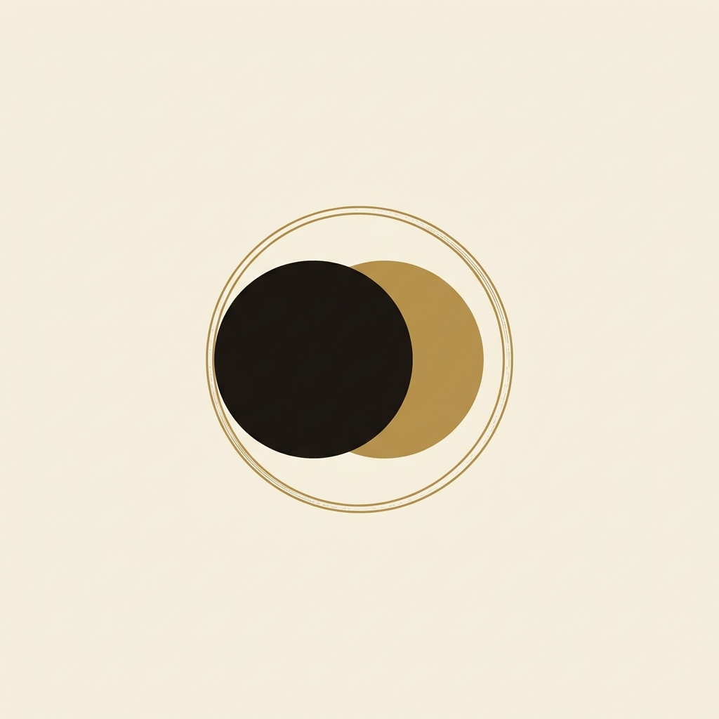
L'Eclissi
An ink disc overlapping a gold one inside a hairline ring — graphic, modern, GQ-confident. The strongest app icon and the boldest departure.
LUMENALLockupHow to choose
- Pairing with the look directions: La Rivista → 01 or 10 · Terme di Luce → 03 or 09 · Atelier Notte → 10 or 04 · The Golden Hour → 05 or 01.
- Scalability: 01, 02, 05 and 10 survive favicon size cleanly; 06 is a packaging/report crest rather than an app icon.
- System thinking: a strong outcome is a pair — one primary mark (e.g. 01 Sole Inciso) plus 06 Il Sigillo as the premium seal used on reports, boxes and candles.
- Versus Round 1: these trade cosmic indigo for stationery ivory — pick the round that matches the chosen design direction rather than mixing.
- Vector proof: 04 La Stella has been rebuilt as clean SVG as a trial — see La Stella — Vector Trial for colorways, the size ramp and lockups.